
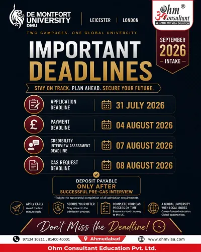
🎓 Study in the UK – September 2026 Intake 🇬🇧
De Montfort University (DMU) – Leicester | London Ca...
2026-06-26T10:04:15  read more


1. Key Value Propositions The flyer emphasizes 'low-friction' entry, targeting common pain points for international students: Academic Ease: Highlights 'No IELTS, ' appealing to students who may be intimidated by standardized English proficiency tests. Process Efficiency: Promises 'No Interview' and a 'High Visa Success Rate, ' reducing the anxiety often associated with strict immigration protocols. Professional Trust: Branded as 'A Complete Visa Solution, ' positioning the agency as a one-stop-shop. 2. Visual Design Elements The Hero Image: Features a student in a thoughtful pose, symbolizing the decision-making process, juxtaposed against the iconic Merlion Park and Singapore skyline to evoke a sense of 'adventure meets education.' Color Palette: The use of coral/salmon pink is warm and inviting, contrasting with the professional black and white footer that contains the call-to-action (CTA). Typography: Large, bold serif fonts make the primary message ('STUDY IN SINGAPORE') unmistakable, even at a quick glance. 3. Contact & Conversion The bottom banner is dedicated to high-visibility contact information, including: Direct Access: Two prominent phone numbers for immediate consultation. Digital Presence: A clear URL (www.ohmvisa.com) for users to research further. 💡 Recommendation for Optimization While the flyer is highly effective for social media or print distribution, you might consider: Social Proof: Adding a small badge or text line mentioning '500+ Students Placed' to further bolster the 'High Success Rate' claim.

We hate spam too.
